Tuesday, March 31, 2009


Each month or so we prepared outdoor boards for a variety of subjects Chevy Dealers were interested in supporting. This was a good deal for Chevrolet and for the dealers. Chevy paid for the production of the posters and the dealers paid for the posting. The dealer always had space at the bottom of the poster to put his name. These were lots of fun to do and often represented some of our best work. 

This is a very nice change of pace for product illustration. No need to picture the trucks as they actually appear because the idea simply illustrated is more important. Back then trucks had yet to gain the appeal they enjoy today and there was a need to suggest uses other than work. Converting your truck to a mobile home was becoming very popular. This outdoor was prepared for Chevy Dealers to use. 

A large number of Chevy outdoor posters were painted on Chevrolet owned or leased locations. They were in very good locations usually in the city where traffic was known to be heavy. It took many years to acquire these spots as they became available. The creative possibilities for these boards were greater than those posed by the paper locations. They were larger and could accommodate cut-out sections that went beyond the edges of the board. The message painted on the boards usually lasted a little longer than the paper outdoor posters.

Monday, March 30, 2009


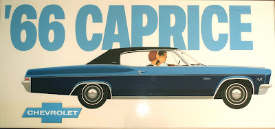
This Caprice board and the two that follow were used to announce the 1966 Chevrolet products. Outdoor was always an important part of the Chevrolet effort to introduce their cars. There were Chevy posters at nearly every important location in America. At the time print advertising--Newspapers, Magazines, and Outdoor made up the bulk of Chevrolet's effort to introduce new products. TV and Radio were important and becoming more important as the months and years passed but for now it was print that carried the load. These boards had one objective--Show the new cars and establish their names. Caprice had been introduce the year before and done very well but there continued to be a need to identify individual Chevys because Chevrolet was becoming a little General Motors within GM. Impala was still very important and Bel Air had been reduced a bit.
These boards, while not particularly memorable, did what they were asked to do. The product illustrations are outstanding examples of the contribution artists made at the time.  I still like the simplicity and directness of the executions and am pleased to show them now.

There was probably a Chevy logo on this ad when it ran. Probably in Chevy blue. The car isn't as shinny as some of todays illustrations in magazines but it works beautifully for outdoor. The body lines and shapes show just the way the designers at Chevy meant then to be. Poster art needs to take into account the fleeting look most people get of it. If you are driving by at 55 0r 65 MPH you get no chance to see the the little details that make magazine illustrations more interesting. You do get what the new car looks like in this case the name of it.

I wish I had better color on on this Announcement board. It is old and faded now but was a very powerful illustration at the time. The Jet-Smoother thought is there but in a very minor way. The next poster shown below gives it lots more play. I like the simplicity of these boards. Big type and strong product illustration for getting the new Chevrolets launched.

Jet-Smooth had been a theme for the big Chevy for some time. I think it originated with Ted Little, our Board Chairman at Campbell-Ewald. We called him "Big Daddy" but never to his face. He had been a copy writer earlier in his ad career and sometimes felt free to contribute to the creative product. While the theme wouldn't mean much today it was just fine back then when flight had only recently changed from prop planes to jets. The jet flight was very much smoother than the old prop planes. Faster too. Because the theme had been in use for sometime I thought I could simply add ER to it and have a nice outdoor board that was in support of the theme and also showed the new Impala to advantage. I wish I could remember the name of the artist. If you recognize your work please let me know so I can give you credit for a very nice illustration.
I thought having the copy as part of the pavement was a nice touch too.

Sunday, March 29, 2009


This is what announcement outdoor did best in the mind of Chevy--show the new car and tell who was offering it. If that is the objective then it can't be done much better than this. When people view outdoor ads it is for only a brief few seconds in most locations. The illustration may have been done by Dave Lindsay. I wish I could remember but I am happy to have saved this example from so long ago.

This is a very nice illustration of a 1965 Chevy convertible that has faded a bit but still shows what was possible back then. I think it was intended for an outdoor board but could have been used for a magazine or catalog illustration too. Wish I knew who did the work--could have been one of the fine West Coast illustrators or one of the Detroit group. There was lots of demand for this kind of work then and there were quite a few artists capable of this degree of excellence. 

I'll bet no car illustrator did this picture of the new 1958 Impala with the Turbo-Thrust V8. But, it says all the right things about Chevy performance. Ideas like this with no actual product shown were always a difficult sell to our Chevy clients. This was a very memorable outdoor board for the time. A few years later Pontiac used the same symbol to great advantage. 

Saturday, March 28, 2009


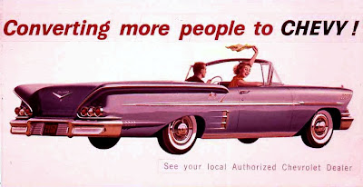
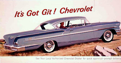
I wish the color was better on this 1958 Impala poster and most of the other boards in this series. But they are taken from old slides and are better than not seeing them at all. Outdoor ads are kind of like old newspaper ads in terms of longevity. The newspaper ads are used to wrap the trash and the outdoor ads are papered over when their time is up never to be seen again. Still outdoor ads for Chevy were very important in getting their new products before the public. A posting for Chevy would cover just about every major stretch of highway and important intersection in America. The copy makes a good competitive leadership statement while calling attention to the great looking new Impala convertible. Photography wasn't used for outdoor back then and the product illustrations are so strong one might wonder if illustration could help some car lines even today. If the reason for showing a car on an outdoor board is to show how it looks illustrations are perhaps better than photography.

This was the first year for the 1958 Impala. It was a real departure from the very lovable 1957 Bel Air and it was larger and more luxurious too. The artist for this illustration has given the car considerable extra length. You can see it in the area behind the rear wheels. But you must remember this was a time of lower, longer, and wider for cars of all kinds. And you cant blame the artist alone for the extra length on the car because a Campbell-Ewald Art Director had to approve the pencil drawing on the car before it was finally rendered. There were guys in art studios that could do the pencil drawings from photographs by cutting them apart and then spreading them out to get the required look to be penciled on to illustration board and then rendered by an illustrator. Their talent for doing this went largely unrecognized but was essential as the top notch illustrators seldom did their own pencil drawings.

1958 Chevrolet Outdoor Board Layout


This is what a rough layout looks like. It was most likely made by one of the regular art directors on the account. It may have been shown to the client just as you see it or it could have have been sent on to an art studio for a more comprehensive rendition. My guess is that it went to our Chevy client as you see it. It may have not been chosen to be produced or it may have moved to another stage with a different view of the car or with a new copy line. Anyhow it gives you an idea of the kind of thing that was often made in the agency. This was just a short time after the introduction of magic markers. Before that, layouts were rendered with pastels. They were very messy and required a spray of fixative applied to keep them from being smeared. A long way from the computers that are used today for very sharp and realistic layouts.

Wednesday, February 25, 2009


The new Corvette for '63 was something else. For the first time you could own a roadster like this or what we now call a split-window coupe. There was an outdoor board for each line of Chevy offerings but I have only two. This one and the big Chevy below. The story of the word "Exciting" is related below. This illustration was in color and as I recall it was a black Corvette so not too different from our picture here. This may have been done by Dave Lindsay as well as the Chevy below.

This 1963 Chevrolet Announcement Poster has an illustration by one of the best car illustrators to come out of Detroit--Dave Lindsay. He was amazing in that he could paint a car like this in record time and still deliver an illustration few could match. He didn't do the people but that may have been because he had so much work he didn't have the time. The word "Exciting" was added to the advertising concept being used, at the last minute by the then board chairman of Campbell- Ewald, Ted Little. There were several more boards involved--one for each car line. I had some difficulty trying to find a good way to add the word. Finally I decided that it should look like someone had taken black paint and added it to our board. The art studio made several attempts at the lettering but came up with nothing I felt was right. Then I put several layout pads and some black poster paint and brushes in the hallway at the GM building where our offices were and asked everyone to paint a the word exciting. Even the secretaries tried it. I don't remember who did this one but it was somebody on our staff. When you are making ads things sometimes do not turn out the way you intended but you make do with whatever the situation turns out to be. (I wish I had a better reproduction of a very great car illustration.)

A really beautiful illustration of a 1961 Chevy that was never used so far as I can determine. I wish I had a better reproduction of it. I'll bet the car was done by one illustrator and the people by another. That's the way studios sometimes worked in those days. Car art was a very special skill and those best at it may or may nor have been good with figure illustration but there was always somebody that was very good at it. I don't remember why this board didn't run but now it can be seen. I'll bet you wish you had one of these great Chevrolets now. They are worth a ton.